



The Problem
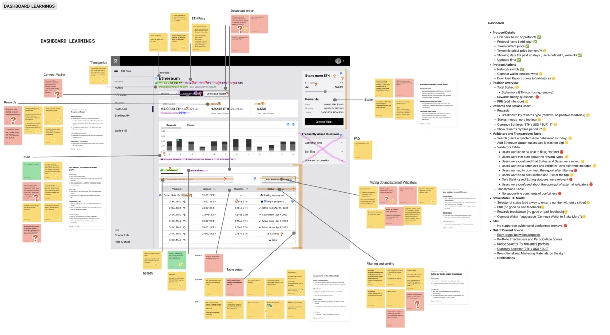
Usability tests, customer service records and interviews showed the existing dashboard was cluttered, confusing, and required deep blockchain knowledge to interpret. Novices struggled to find and act on key data, while experienced users found it inefficient. The redesign needed to simplify complexity without losing depth.
The Solution
1. Research & Benchmarking
We interviewed stakeholders and compared Blockdaemon’s dashboard to competitors in Web3 and traditional finance. This revealed gaps and opportunities for improvement.
2. Collaborative Workshop
A collaborative session with product, engineering, and marketing teams focused on two goals:
- Make the dashboard intuitive and actionable for all users
- Improve the visual hierarchy to highlight critical data
3. Iterative Design & Development
Prototypes evolved through continuous user feedback, ensuring alignment with Blockdaemon’s design system. Close engineering collaboration and regular leadership check-ins kept the project focused and flexible.
4. Testing & Launch
Rigorous QA in a staging environment resolved inconsistencies before release. Early user feedback praised the improved navigation and decision-making, with strong initial results.
A New Approach to Testing
Recruiting busy, specialized participants for usability tests was tough. To mediate that, we experimented with synthetic users—AI clones mimicking real users’ traits. While still emerging, this method achieved 90% parity with organic users, offering a promising solution for future testing.
Measurable Impact
After launch:
- User satisfaction rose from 65% to 92%.
- Time to complete key tasks dropped from 8 minutes to 2 minutes.
- Error rates fell from 15% to 3%.
- Adoption increased from 40% to 85% within three months.
- Support tickets related to dashboard use decreased by 60%.
The redesign delivered a dashboard that solved usability challenges and created momentum for wider redesign work. By focusing on user needs and fostering collaboration, the project improved both the product and Blockdaemon’s internal processes.