
In New York, I spoke to more than 20 people about how often they left the city and spent time outdoors. What surprised me was that very few had done anything nature-related in the previous three to five years, and some of their reasons were wonderfully specific: they worried about getting lost, getting dirty, getting hurt, or being eaten by bears.
The interviews began with a question I had been thinking about while studying Sustainability and Environmental Management at Harvard. Research suggested that time outside could make people happier and healthier, while also making them more inclined to protect the natural world. I wondered whether reconnecting urban people with nature could change more than their weekends.
At first, the obvious problem seemed to be access to information. People said they lacked details about transport, routes, equipment, and what to expect, but most of that information already existed. The deeper issue appeared to be predisposition: when the outdoors had not been part of your childhood, it could feel distant and slightly alien as an adult.
That changed the product question. We were not trying to build a better directory of hiking routes; we were trying to make the outdoors feel relevant to people who did not yet see themselves as outdoor people.
Project context. I co-founded Wonders and worked as CEO, CPO, product designer, and creative director from January 2014 to March 2016, across New York, Austin, and San Francisco. Our core team included Bastiaan Marinus van de Weerd, Rey Joaquin, and Ana Maria Moreno, alongside a remote development team in Chile.
Making the Outdoors Feel Culturally Closer
We formed a small team and explored several ways to influence that relationship, from social campaigns and photography competitions to a mobile product. Mobile was the natural medium, but the more useful insight was that “coolness” shaped behaviour for the young urban audience we had been speaking to. The outdoors did not only need to become easier; it needed to feel culturally closer.
Around the same time, we saw an interesting shift among outdoor brands. The old industry hero was the heavily equipped climber at the top of Denali, while newer brands such as Poler, TOPO, and Iron & Resin celebrated casual weekend trips, friends around a campfire, and the visual culture surrounding them. Their marketing increasingly relied on aspirational stories rather than technical product claims.
That gave us the shape of Wonders. Brands wanted a better way to tell stories and sell products through them, photographers and bloggers wanted exposure, and users wanted beautiful content that made the outdoors feel possible. If those incentives could reinforce one another, the app could have a reliable supply of content, built-in distribution, and the beginnings of a business model.
The first meaningful test was not an app. We created visual sketches in Sketch and Flinto, then showed them to people we had interviewed and to prospective brand partners. Users kept scrolling through the mocked content feed, while some brands asked whether they could white-label the concept. Neither reaction proved that the business would work, but together they were enough to justify the next step.
Building Only What the Next Question Required
We applied to Techstars knowing the odds were roughly one in 150. After a deliberately theatrical selection interview, Ana and I received the acceptance email and moved to Austin. It made the project real, but funding did not make it sensible to build everything at once.
The product had to work for three groups without feeling like a compromise between them. Users wanted quality stories that made them want to go outside. Brands ultimately wanted to sell products, while photographers and bloggers wanted reach and recognition. We worked with all three groups throughout the design process, but we were careful not to let Wonders turn into a large, beautiful billboard.
Our first native Swift version was deliberately bare-bones. The main assumption underneath Wonders was that people would engage with the stories, so that was almost all we tested. Features that did not help answer that question were faked or left out, while our community of more than 250 photographers, bloggers, and brands supplied roughly 300 stories and 3,000 photographs for the launch.
The work around the software mattered as much as the software itself. We sent postcards to early contributors, built relationships with photographers and outdoor brands, and kept the content community close enough that we could learn what made participation worthwhile for them.
Once the product was live, the metrics gave us a more useful form of criticism than our opinions. People spent little time in the separate photo feed and went directly to stories, so we removed the photo section. Engagement improved by about 30%, and a later UI improvement added another 15%.
By the end of our iterations, half of users were opening Wonders weekly and 15% were using it daily. The app had a five-star App Store rating, and people wrote to tell us it had prompted them to book a surfing lesson or finally take the trip to Yosemite they had been postponing. Those messages were the clearest sign that the original idea was showing up in real behaviour.
The interesting part was not that every change worked. It was that a smaller product made the signal easier to read. When fewer ideas compete inside an experience, it becomes much clearer what people understand, value, and return for.
Letting the Content Set the Visual System
I looked to print for the visual direction because magazines had spent much longer learning how photography, typography, and text could coexist. Saturdays Magazine, Scott Hansen, Deus ex Machina, Pilgrim Surf Supply, Mollusk, Patagonia, Land, and Foster Huntington became important references. Digital publishing still felt visually young, while print already knew how to let strong content lead.
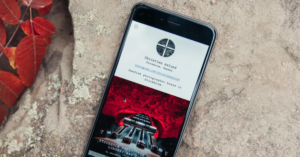
We kept the interface black and white so it would sit behind the colour of the photography. We also chose Prestige Elite, a typewriter-inspired monospace face, and avoided bold or italic styles. Those constraints were not decoration. They created a small set of rules that simplified decisions and made the content feel more distinctive.
Wonders also needed to communicate something harder to explain: the primal and slightly mysterious pull of being outdoors. We worked with Keith Davis Young, Garrett DeRosset, and Land on iconography rooted in mystic symbolism, especially for the 2.0 release. The aim was not to make nature look useful. It was to make the attraction to it feel recognisable.
Earning the Engineering
Later, when we explored monetisation, we often implemented only the interface and connected it to something basic such as Google Docs. Coding was the most expensive way to test an idea, so we used it only when a simpler experiment could no longer answer the question. The principle was not to avoid engineering; it was to earn it.
Wonders left me with a more useful version of “build, measure, learn.” The build should be the cheapest honest test of the next important assumption, and the result should still feel magical enough that people can respond to the real experience rather than forgive a broken one. Metrics keep the learning honest, but the team, the culture around the product, and the founders’ own motivations decide whether the work can survive long enough to matter.
I still think about those early conversations in New York. The problem was never that instructions for getting outdoors were impossible to find. The problem was that nature felt like something for somebody else, and the most useful thing Wonders could do was make that distance feel smaller.