
The first screen in most mood trackers asks for a surprisingly hard thing: reduce a complicated inner state to a point on a scale. For this concept with MetaLab for Headspace, I wanted to explore a quieter alternative—one where reflection began by speaking and the technology listened for patterns rather than asking someone to complete a form.
The brief was rooted in work. It can give us purpose, challenge and self-worth, but it also produces thoughts and moods that are easy to carry without really noticing.
Starting With the Problem, Not the Format
I began by analysing the brief for its assumptions and constraints, then moved into contextual research. As a regular meditator and very occasional journal writer, I knew something about the subject, but I did not want my own habits to define the solution.
The research moved across popular press, academic writing, market reports, TED talks and first-person accounts of mindfulness and journaling at work. I also used proxy data from existing mindfulness apps to form an initial view of the people this product might serve.
What stood out was how blurred the categories were. Journaling, meditation, note-taking and talking with a friend may look like different behaviours, but each can be a way of building a more useful relationship with your own mind.
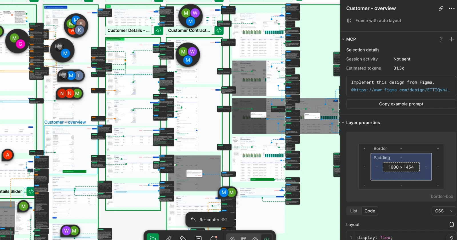
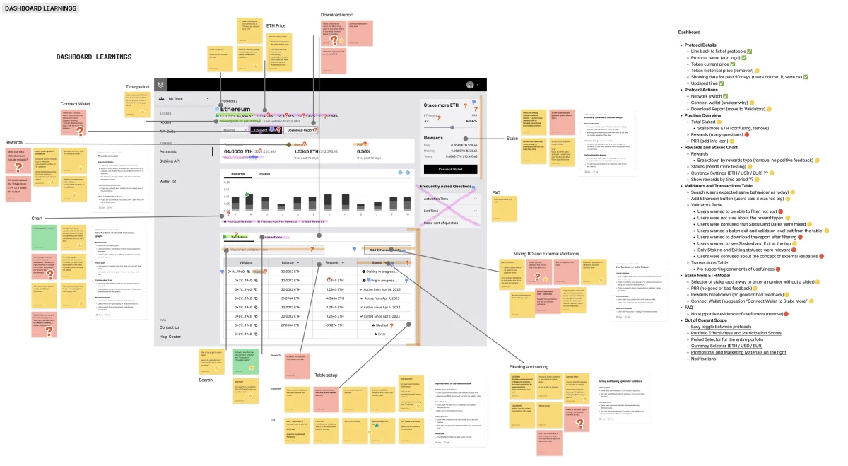
I collected each useful fact, quote and observation on a separate digital post-it in Figma, then grouped them into an affinity map. The full research workspace is available in the Figma source.
The 2021 source set pointed to four broad themes. Mental health was both a serious human issue and a large commercial category; the mindfulness market was crowded; employers were becoming increasingly interested in mindfulness; and journaling appeared valuable but difficult to sustain.
Some of the market estimates were striking: more than 2,500 mindfulness apps, with Headspace and Calm reportedly owning over 70% of the market, and mental-health costs projected to reach $6 trillion by 2030. These were dated estimates rather than permanent facts, but they made the product challenge clear at the time: another conventional tracker would have very little reason to exist.
The behavioural research was more useful. People described journaling as beneficial, but also tedious, difficult and time-consuming, and many returned to it mainly during hard decisions or difficult periods rather than as an everyday practice.
Two People at the Edges
I turned the early findings into two proto-personas, Frank and Astrid. They sat at different ends of the proxy demographics and had deliberately different Jobs To Be Done, so the concept had to stretch beyond one familiar type of mindfulness user.
This was not a substitute for field research. It was a way to make the current assumptions visible, and with more time I would have interviewed people before giving either persona too much authority.
Ideating Before Looking at Competitors
I deliberately postponed the competitive review until after the first ideation round. The idea was simple: form a few independent thoughts before seeing the patterns that existing products had already made feel inevitable.
I shortened the brief to one working question: How might we make inner reflection feel smooth and compelling? Then I used a loose version of Crazy 8s to explore possible answers.
Only then did I look at the formats people already used. These ranged from a conversation with a friend and a decorated notebook to note-taking software, meditation products and purpose-built journals.
At the same time, I kept thinking about Her and its picture of technology that can understand and respond without constantly drawing attention to itself. Articles about screen fatigue and the rise of social audio made voice feel timely too, especially as I was an enthusiastic Clubhouse user and podcast listener.
Choosing the Less Obvious Concept
I ran a second ideation round after the competitive and trend research. Normally I would have evaluated the ideas with a multidisciplinary team and used dot voting, but this was a solo assignment, and I was starting to miss the creative friction of other people.
Several ideas began to fit together, while others exposed immediate privacy problems. One cluster resembled the dominant journaling pattern—choose a feeling on a Likert scale, add a typed note, then inspect a mood graph—and it felt too familiar to be a useful direction.
The concept I chose combined four behaviours:
- A person could speak freely into their phone without selecting a score or typing a note.
- The product could connect the content of the reflection with signals in sentiment, tone and intensity.
- Over time, it could return patterns that were difficult to see inside a single entry.
- People could anonymously explore voices from others with similar concerns, moving through them like a crowd in which the nearest person gradually became clearer.
The ambition behind the interface was technically large. The imagined system would transcribe speech, interpret language and vocal signals, find correlations across entries and improve its analysis over time.
I also sketched more speculative possibilities, such as identifying that working from home was connected with anxiety or adapting a morning environment through Spotify and Philips Hue. Those ideas were intentionally exploratory; they would have required serious validation around accuracy, privacy, consent and whether the resulting guidance was actually useful.
Turning a Story Into Testable Assumptions
I moved from sketches into a semi-interactive wireframe, a user-flow diagram and a clickable prototype. The point of this stage was not to make the concept look finished, but to expose the questions hidden inside a persuasive story.
The riskiest assumptions were quite concrete:
- Would people understand the product immediately?
- Would they prefer speaking to typing?
- Would they trust anonymous sharing?
- Would hearing people with similar concerns feel supportive rather than intrusive?
- Would AI-generated insights be understandable and genuinely helpful?
- Could the product be built with the required accuracy and safeguards?
- Would the client support the direction?
I was working alone and running out of time, so the prototype was rough. In a real project, the next step would have been concept and usability tests with potential users, followed by feasibility and viability work with engineers, stakeholders and the client.
The working artefacts remain available as a user-flow diagram and an early clickable wireframe. They show how much of the product was still a question rather than an answer.
Giving the Brand More Emotional Range
The second half of the assignment moved from concept to visual design. With no existing brand assets, I began by asking what the product would feel like if it were a person.
On a larger team, I would turn this into a workshop: ask stakeholders to complete a brand-personality questionnaire, compare the answers and use dot voting to locate the shared territory. Here I completed the exercise alone, which made the output a hypothesis to design with rather than a settled identity.
The visual research ranged widely: Stripe, Spotify, Tesla and SpaceX; the interface work behind Her; Mark Rothko and James Turrell; Wall-E; robot companions; and the Barbican’s AI: More Than Human exhibition. The common question was how to humanise AI without making the interface sentimental or overly literal.
Colour became a way to give the product more emotional range. Many products in the category leaned on purple gradients or a consistently gentle mood, while this experience needed to hold feelings that could be bright, tender, restless or unsettled—sometimes at the same time.
The final palette combined neon and pastel versions of primary colours, allowing the product to be bold in one moment and gentle in the next. It also gave the interface a character that felt distinct from the softer, gradient-heavy visual language around it.
For typography, I wanted something fresh but not so experimental that it narrowed the audience. I settled on Manrope, a rounded variable sans-serif whose geometric digits and legibility suited both the emotional tone and the more analytical parts of the product.
Humanising AI Without a Little Robot
The Discover screen set the tone for the rest of the interface. People could move through a field of faces in any direction; the central voices would become louder while the surrounding voices remained present, creating the sensation of walking through a crowd rather than scrolling a feed.
Because I did not have time to commission custom character work, I explored illustration libraries and public toolkits. I eventually chose Amrit Pal Singh’s Toy Faces, then paired them with the new colour system.
The combination felt contemporary and modular. More importantly, it let very different people find some version of themselves in the crowd without tying a particular face to a fixed emotion.
The Listening screen was more difficult. The wireframe used a familiar messaging interface, but the word “recording” felt impersonal, the chat pattern did not belong with the tactile Discover experience, and accurate sentiment analysis might require someone to speak for a minimum amount of time.
Siri-like gradients looked elegant but created a visual mismatch with the more physical faces. I wanted to see what a tactile version of Siri might look like, so I reached for plasticine, coloured post-it notes and scissors.
The experiment was promising but needed more time than the assignment allowed. It also made the simpler answer more visible: the avatars already gave the product an emotional language, so they could become part of the listening experience too.
That introduced a new ambiguity. Would someone understand the difference between their own avatar and the product’s listening presence?
I tried a deliberately bare robot to sharpen the distinction, but it made the concept feel colder and more literal. A better possibility was to let the listening face subtly mirror the speaker’s state and offer occasional prompts, borrowing from the role mirroring plays in active listening.
One Insight at a Time
The Insights section contained the hardest information-design problem. It needed to show relationships between language, emotion and time without turning a personal experience into an analytical dashboard.
I explored richer correlation views, but they quickly became dense and would have required much more time to design responsibly. The simpler solution was a stream of individual insight cards, each presenting one possible connection at a time.
When I put the final screens together, I was surprised by how small the prototype looked. I liked that, because the complexity belonged behind the interface; the person using it only needed a quiet place to speak and notice something that might otherwise have passed by.
The concept remained exactly that: a direction made concrete enough to test, not proof that the behaviour would work. But it clarified a useful design principle for me. A tracker asks someone to describe themselves to a system, while a reflective product can create enough space for them to hear themselves more clearly.
You can watch the prototype video, try the final interactive prototype, or open the complete Figma file. The original Mental Health case study remains available as the source archive.